




01
Positioning
Elevate your vibe.
A modern functional beverage brand, made for lifestyle enjoyment and social connection.
Mitra9 brings seltzers, shots, and drink mixes together under one recognizable identity. Every touchpoint should communicate clarity, sophistication, and credibility.
Our personality
Energetic
Bring a bright, active spirit to every brand moment.
Empowering
Bring a bright, active spirit to every brand moment.
Confident
Keep the message direct, clear, and intentional.
Modern
Make every touchpoint clean, consistent, and recognizable.
read the brand position

02
logo
The primary logo
The Mitra9 logo is the foundation of our visual identity. It pairs a distinctive leaf-inspired symbol with the Mitra9 wordmark. Keep the original geometry, proportions, and relationship between the two elements intact.

The symbol
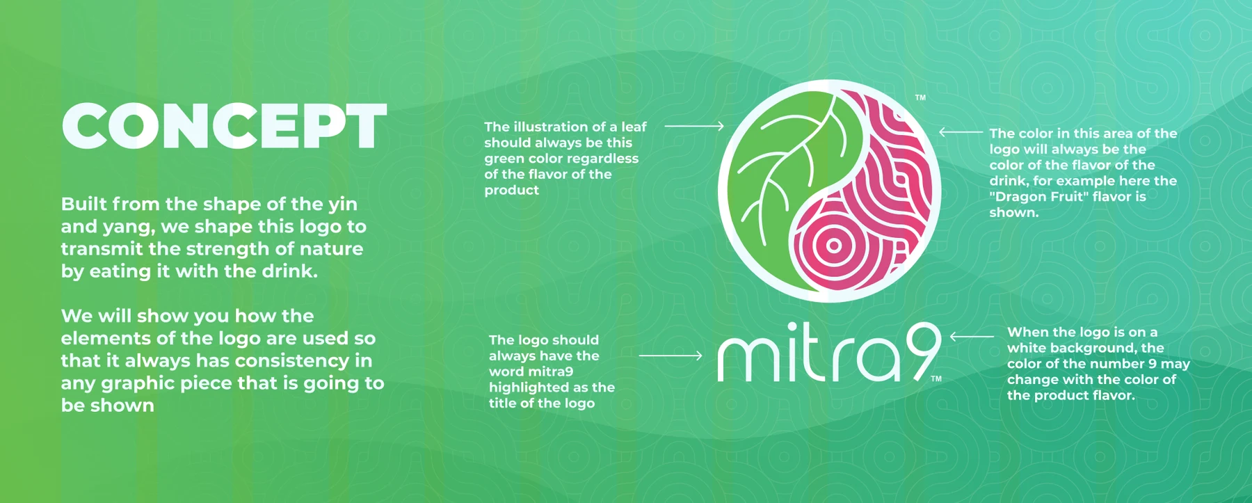
Built around the shape of yin and yang, the symbol brings the natural leaf together with flowing geometric lines. Use the isotype where the full logo would be too small. The leaf remains green; the other half reflects the product’s flavor.
Clear space
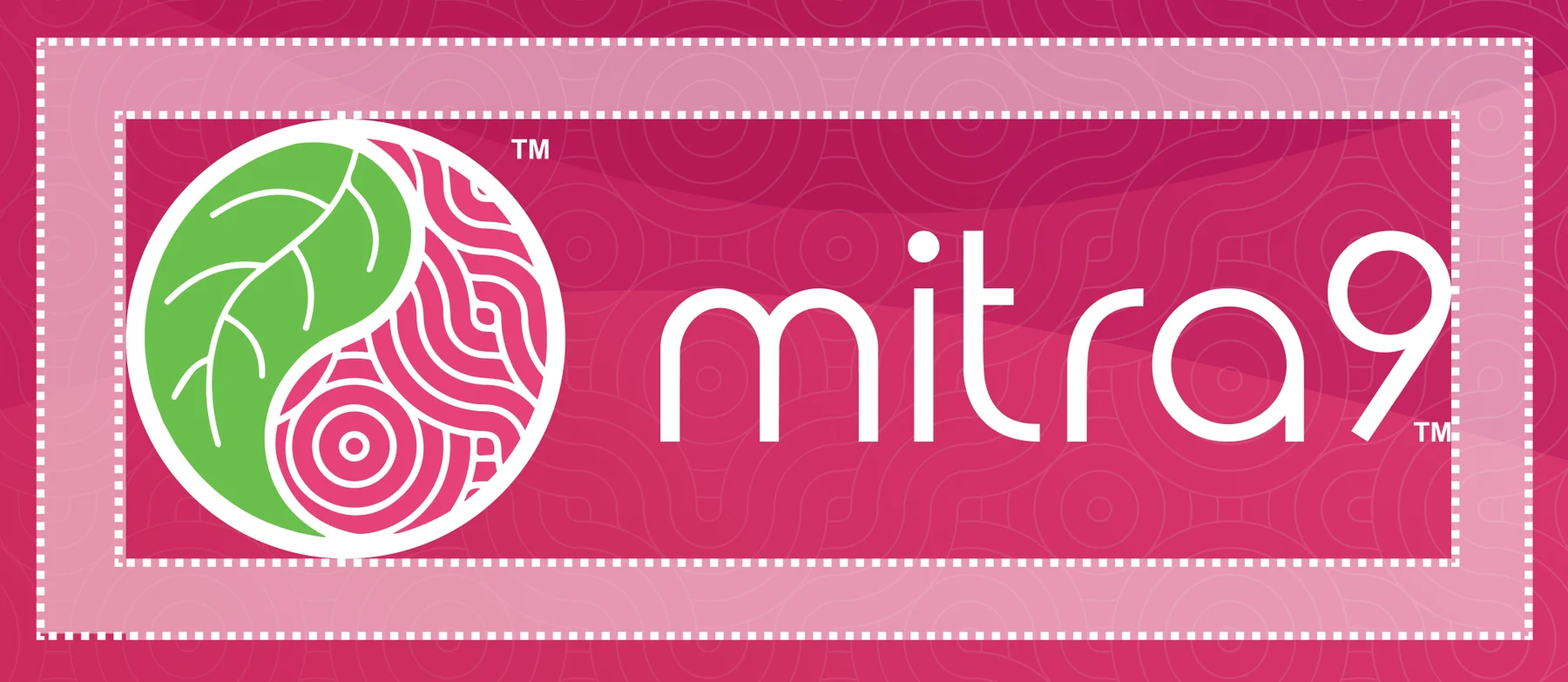
Give the logo room to breathe. Preserve the safe area shown in the source diagram whenever it sits near copy, another mark, or the edge of a layout.
Orientation & scale
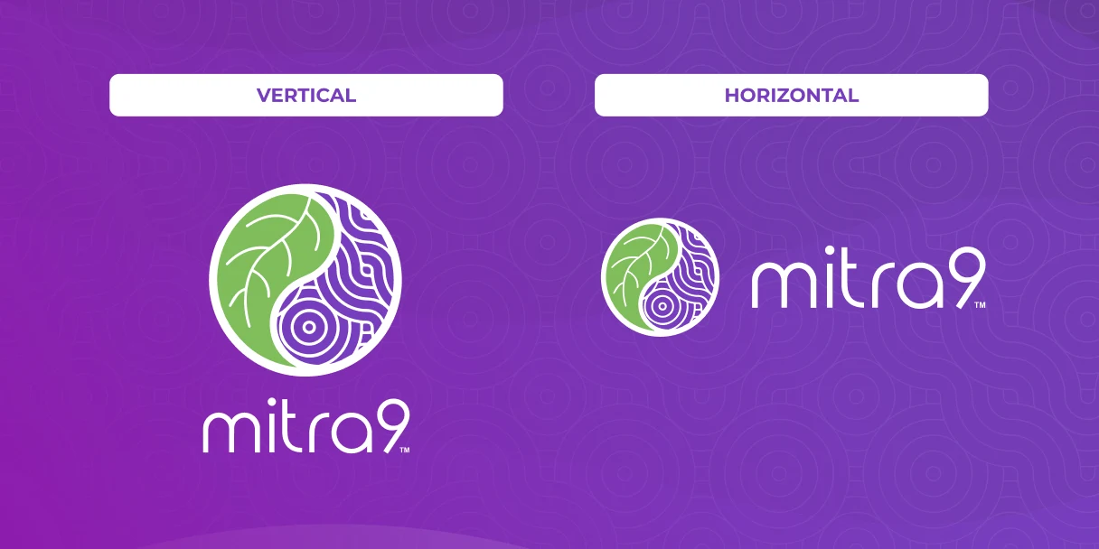
Use the horizontal or vertical arrangement to suit the composition. Scale all elements proportionally. The guide illustrates 84, 60, 48, 32, and 16 px sizes; choose a size that remains legible in the final medium.
View the scaling reference

Keep it consistent

do
- Use the original logo artwork.
- Keep the leaf in its approved green.
- Use the white wordmark on flavor-colored backgrounds.
- Respect clear space and readable contrast.

don't
- Stretch, rotate, or rearrange the logo.
- Outline it or add shadows and effects.
- Introduce alternative brand colors.
- Place it on a background that makes it hard to read.
See the source do’s and don’ts
Download logos

03
Brand elements
Nature, in balance
A leaf. A sense of balance. A little movement.
The symbol takes its structure from yin and yang. Its leaf and flowing linework connect the brand’s natural inspiration with its contemporary visual identity.
Patterns & flow
Flowing curves and repeating geometric linework appear throughout the source guidelines. They add energy to flavor-led color fields and bring continuity across the brand.

One connected system
Let color lead.
Build flavor recognition through a consistent relationship between color and product.
Keep the mark clear.
Graphic elements support the identity. They should never reduce logo legibility.
View the geometric construction

view brand elements

04
Product family
Three ways to Mitra9
One recognizable brand. Three distinct formats.
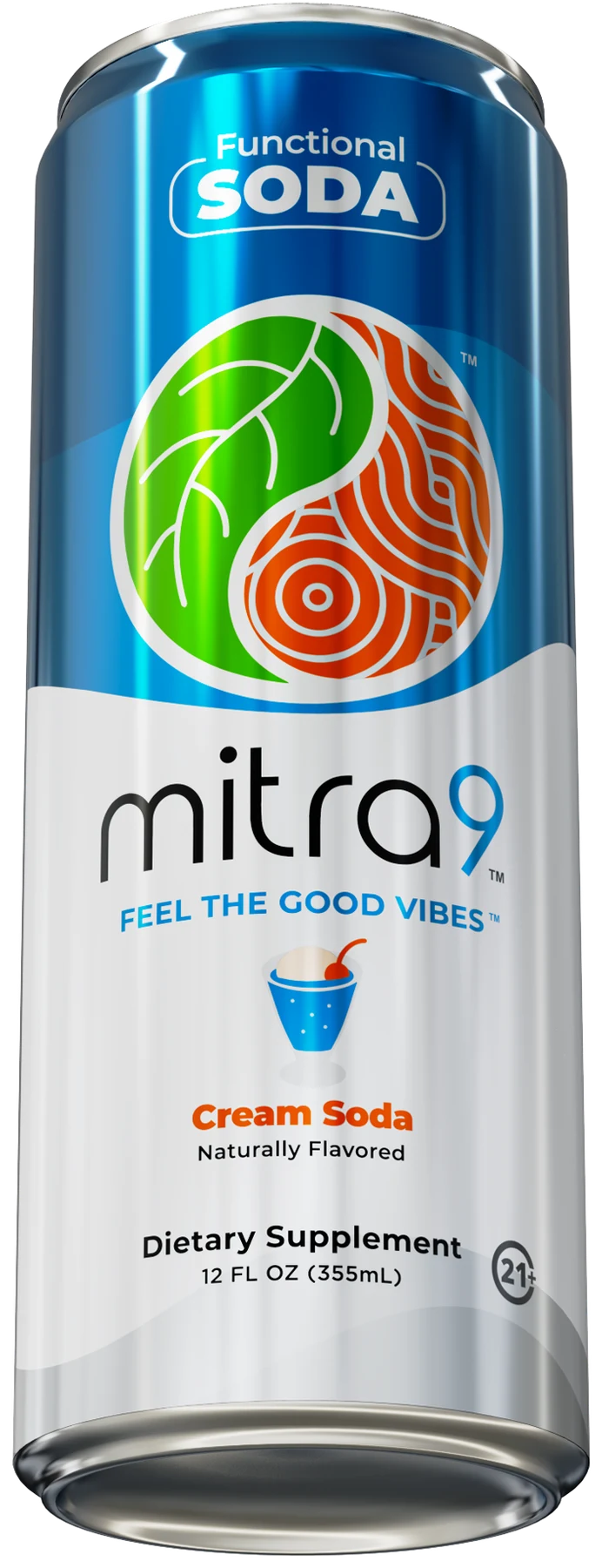
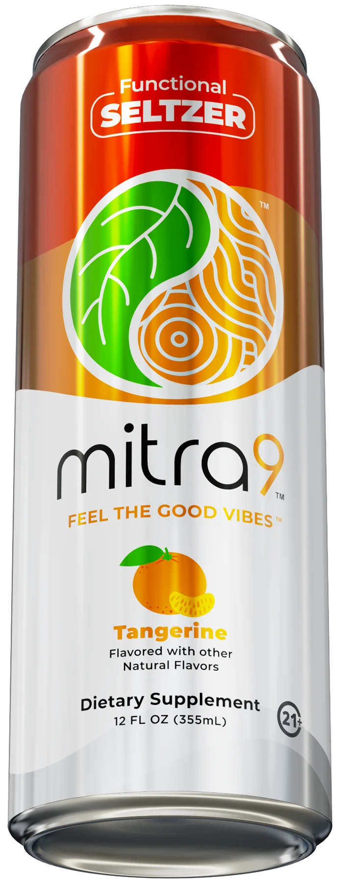
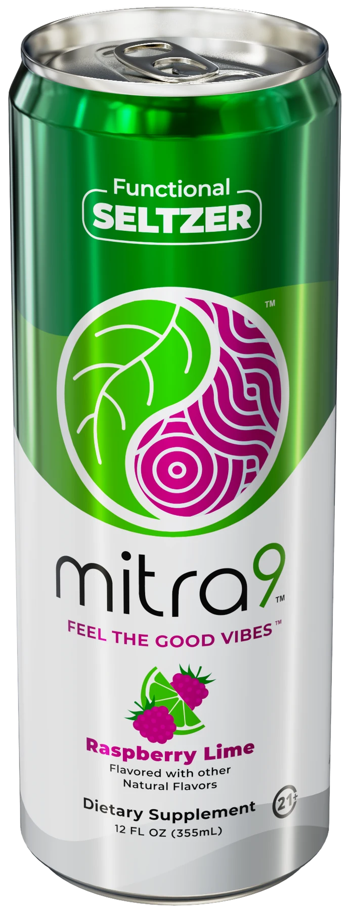
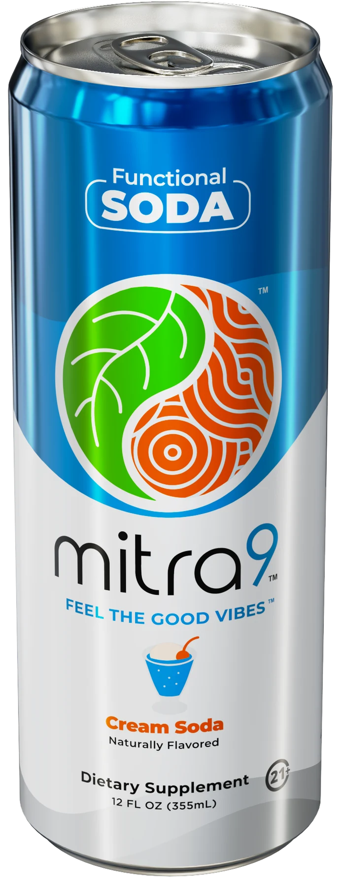
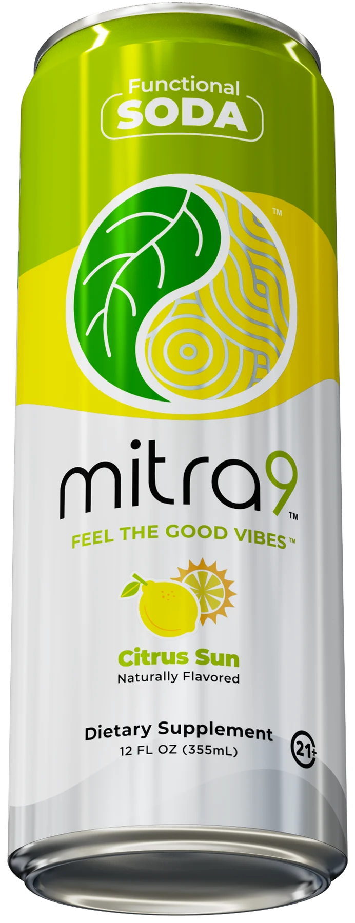
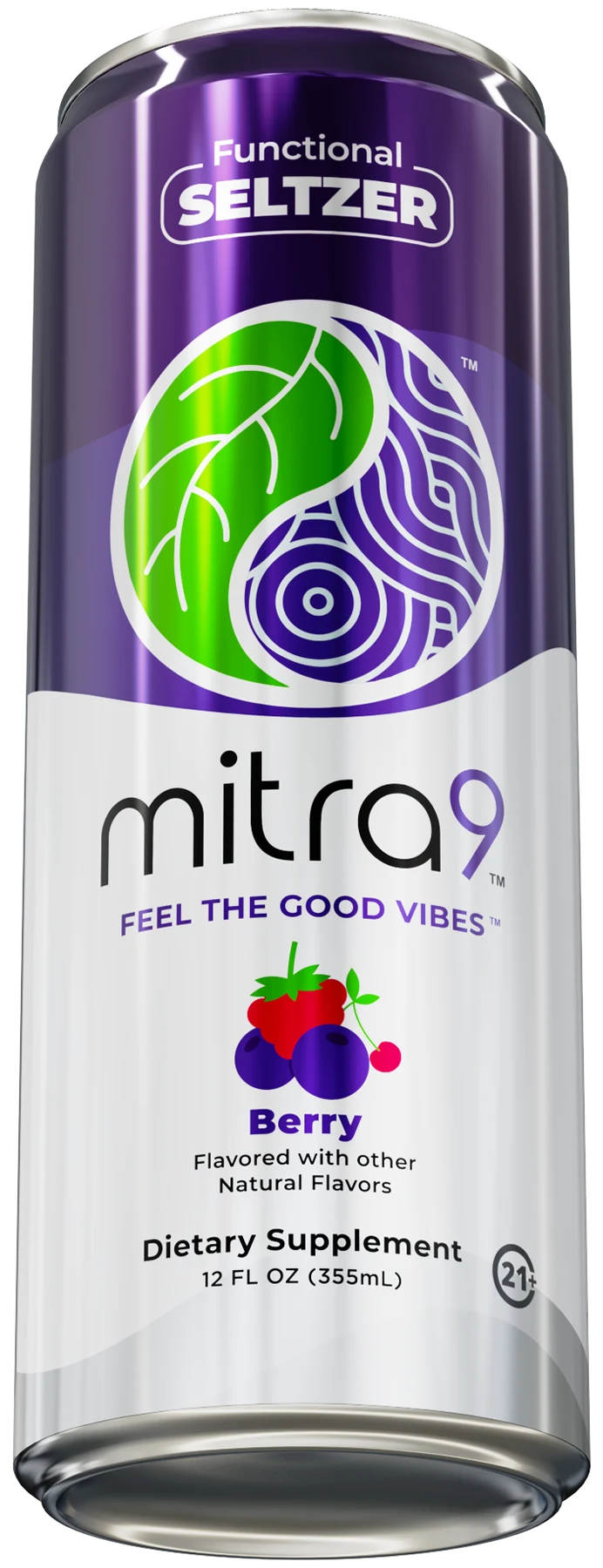
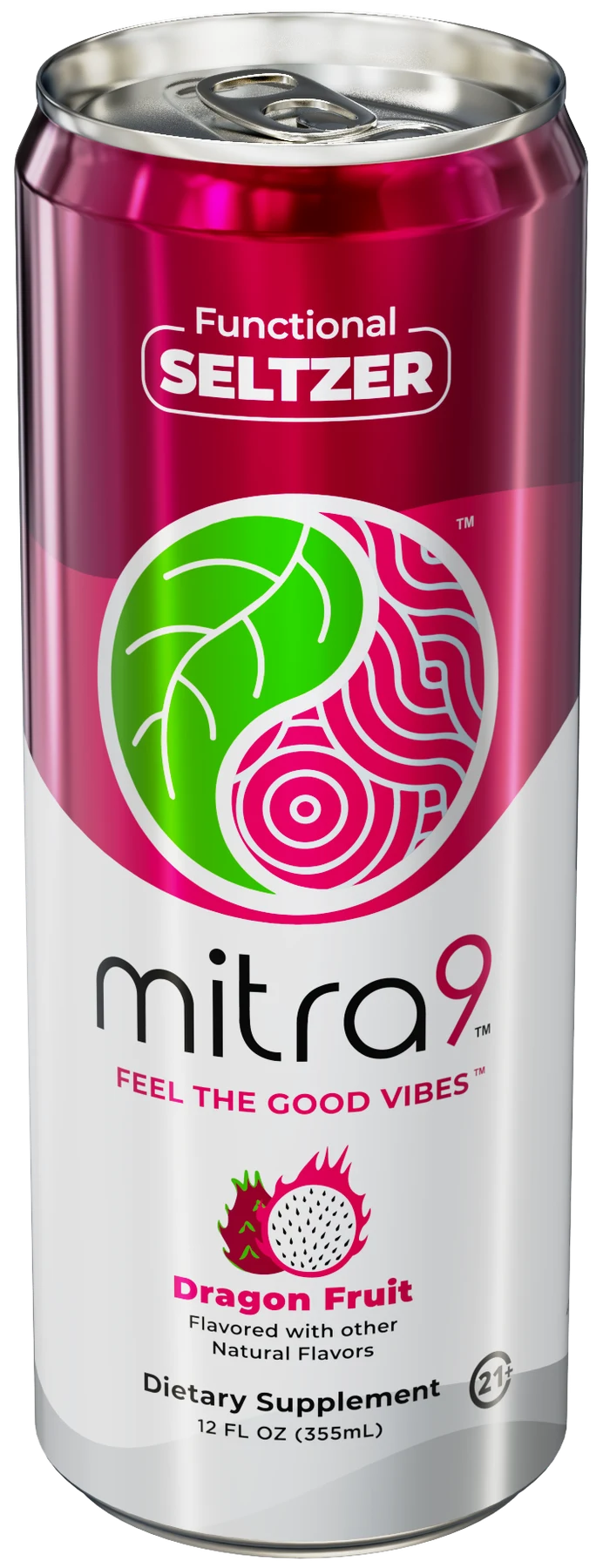
Seltzers, shots, and drink mixes share a common visual language while maintaining a clear identity for each format. Typography, flavor color, and brand elements tie the family together.

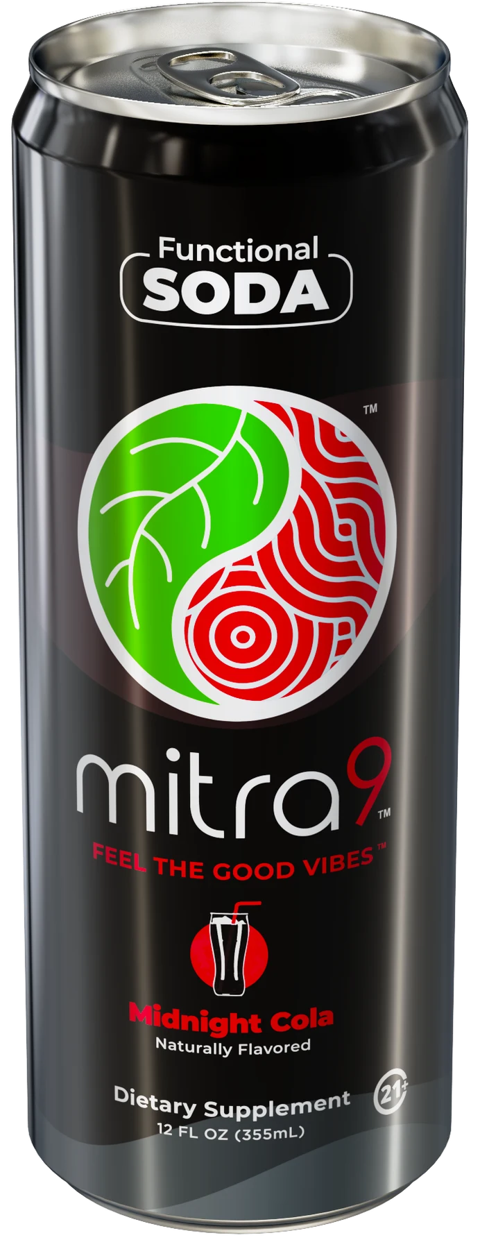
Seltzers & Sodas
Refreshing by nature.
Lightly carbonated, naturally flavored beverages.
Download products


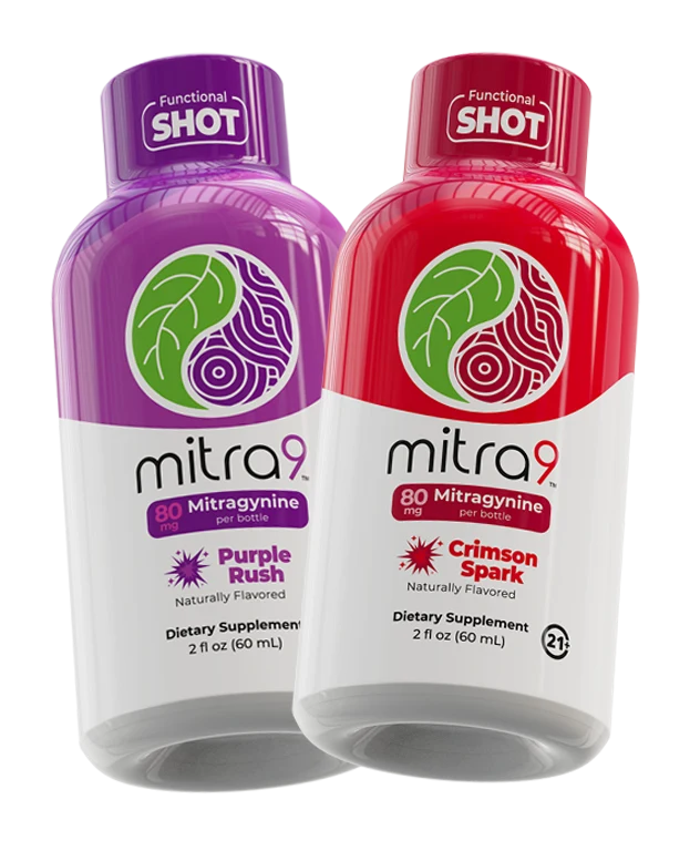
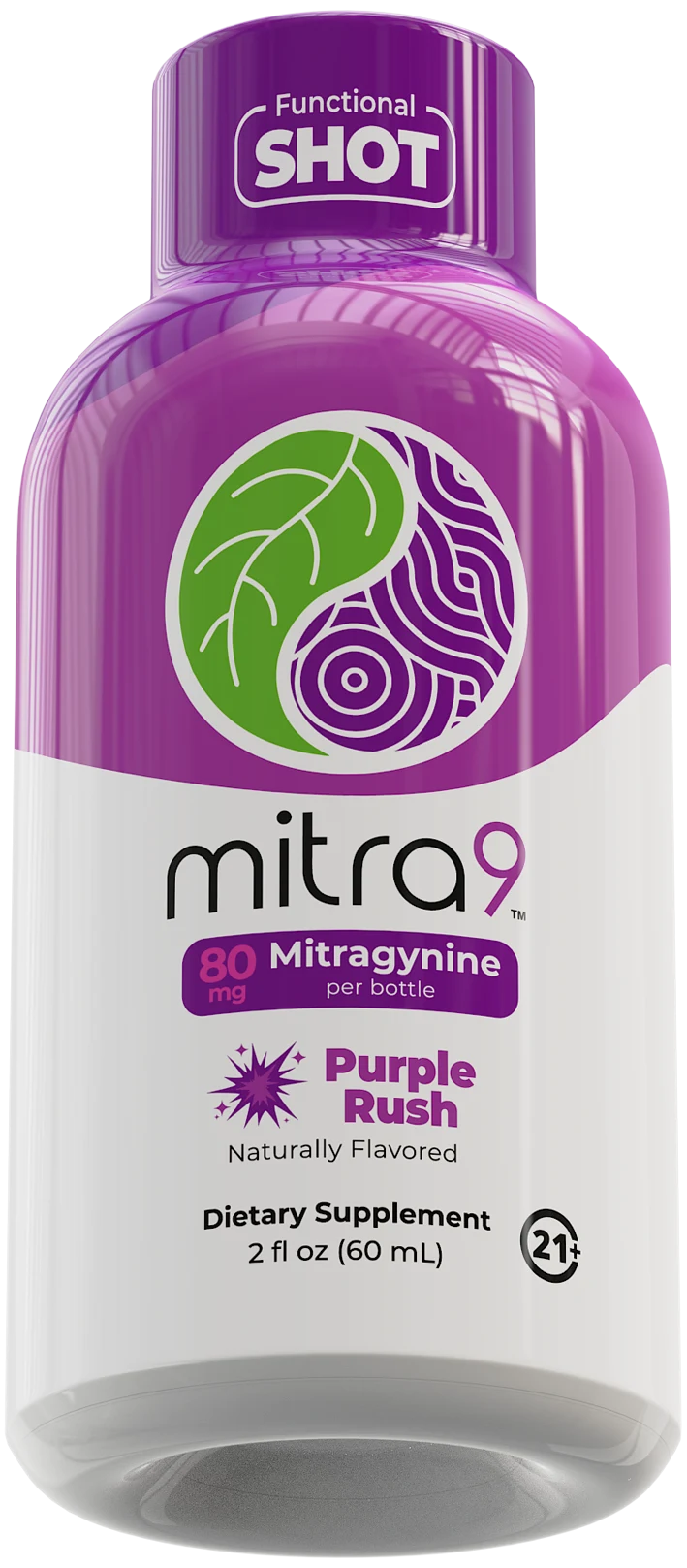
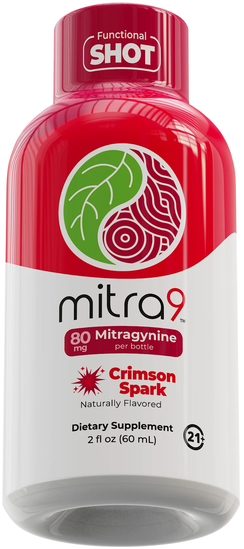
SHOTS
Small format. Same spirit.
A compact format within the Mitra9 family.
Download products

DRINK MIXES
Good vibes to go.
Powdered sachets designed for portability.
Download products




Download all products

05
Typography
Meet Montserrat
Montserrat is Mitra9’s brand typeface across internal and external media. Its geometric letterforms balance a modern, clean feel with expressive, confident headlines.
ABCDEFGHIJKLMNOPQRSTUVWXYZabcdefghijklmnopqrstuvwxyz1234567890 . , ! ?
SOURCE WEIGHTS · MEDIUM / SEMIBOLD / BOLD / EXTRABOLD / BLACK
Try the type
MEDIUM
Feel the good vibes.
SEMIBOLD
Feel the good vibes.
BOLD
Feel the good vibes.
EXTRABOLD
Feel the good vibes.
BLACK
Feel the good vibes.
Build a clear hierarchy
HEADLINES · EXTRABOLD / BLACK
ELEVATE YOUR VIBE.
SUBHEADINGS · BOLD / SEMIBOLD
Good things happen together.
BODY COPY · MEDIUM
Keep information easy to read. Use a clear difference in size and weight to guide the eye from a confident headline to the supporting details.
View the geometric construction

Download Montserrat

06
Color
A flavor-led palette
Every flavor has a color. Every color has a role.
Use flavor color consistently across formats, supported by the primary Mitra9 elements. Build in enough contrast for a clear, recognizable result.
HEX values are transcribed from the supplied guide; RGB is calculated from HEX. Swatches marked “Review needed” contain source conflicts. Their notes explain what must be confirmed before production.
Tangerine

hex
FF4D00
rgb
255,77,0
pantone
1655c
Raspberry Lime
hex
#6abf4b
rgb
106,191,75
pantone
360c
Dragon Fruit
hex
#e6427a
rgb
230,66,122
pantone
205c
Black Cherry
hex
#aa182c
rgb
170,24,44
pantone
187c
watermelon
hex
d7282f
rgb
215,40,47
pantone
1795c
berry
hex
773dbd
rgb
119,61,189
pantone
266c
Tropical
hex
#45c2b1
rgb
69,194,177
pantone
3258c
Root Beer
hex
#b68150
rgb
182,129,80
pantone
729c
Citrus Sun
hex
#c2d500
rgb
194,213,0
pantone
382c
Midnight Cola
hex
#2d2a26
rgb
45,42,38
pantone
BlackC2
Cream Soda
hex
#00a0df
rgb
0,160,223
pantone
299C
Color in context
Protect legibility.
Choose clear, high-contrast combinations. A flavor color should never make important information harder to read.
Keep flavors distinct.
Maintain each flavor’s color across its logo, packaging, and supporting materials.
Compare with the original palette

07
Packaging
Instantly recognizable
Mitra9 packaging should feel clean, modern, and unmistakably part of the family. Make format and flavor clear while preserving the consistency of the core brand.
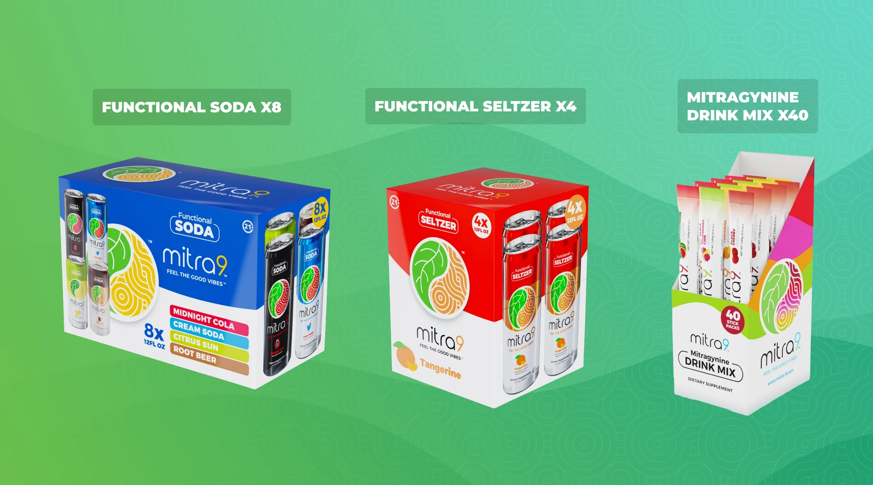
The packaging checklist
Logo placement
Keep the Mitra9 logo prominent on the front panel.
Flavor differentiation
Give each flavor a distinct color while preserving the shared design framework.
Typography & labeling
Make product information and serving details clearly legible, following the approved hierarchy.
Mockups & production
Check the design across cans, bottles, and boxes. Test printing methods and material finishes before release.
08
Photography
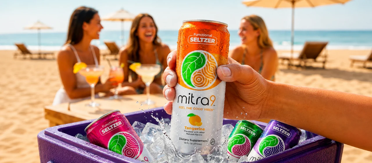
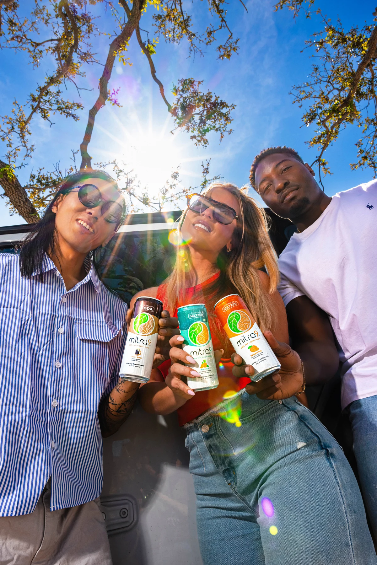
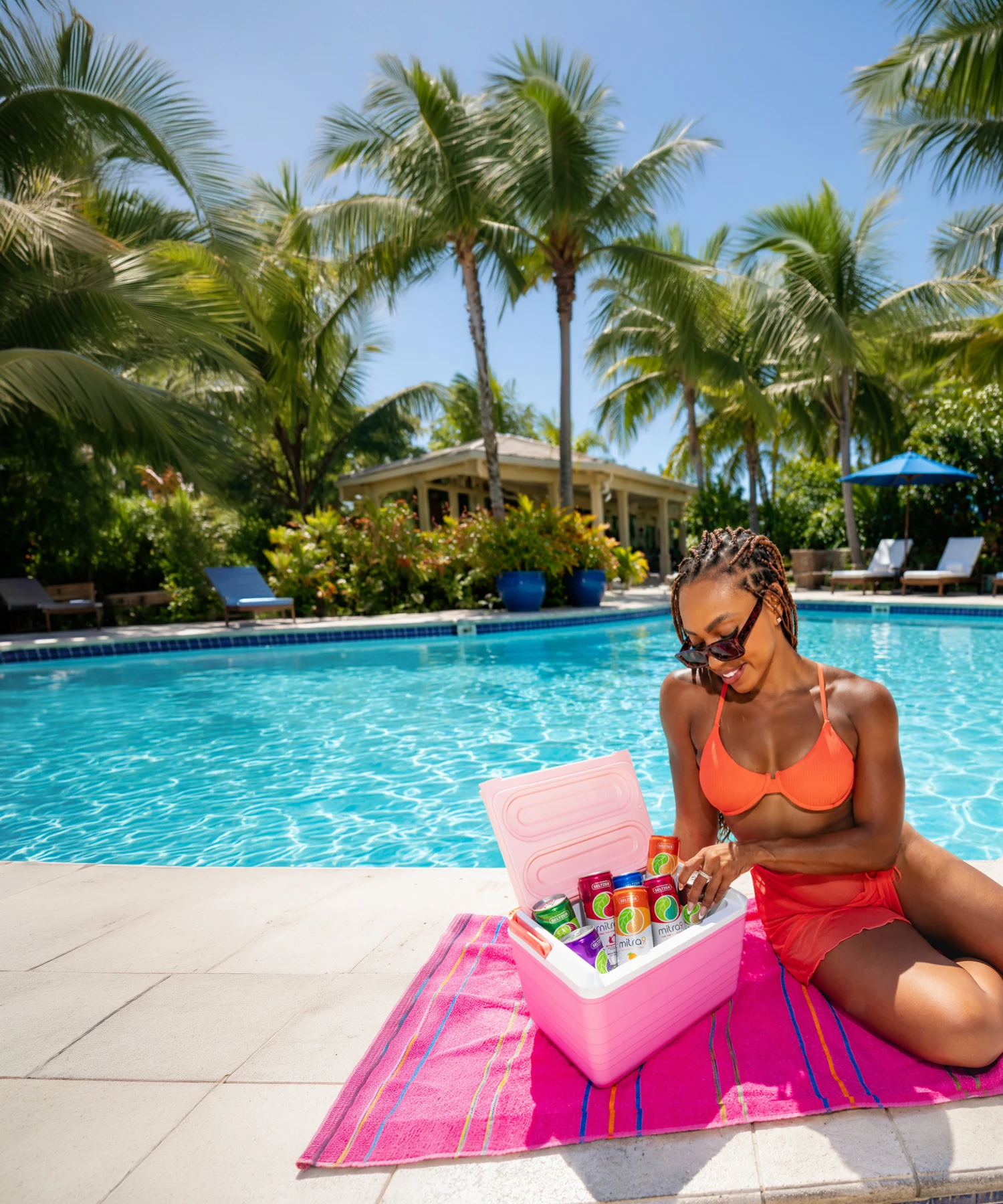
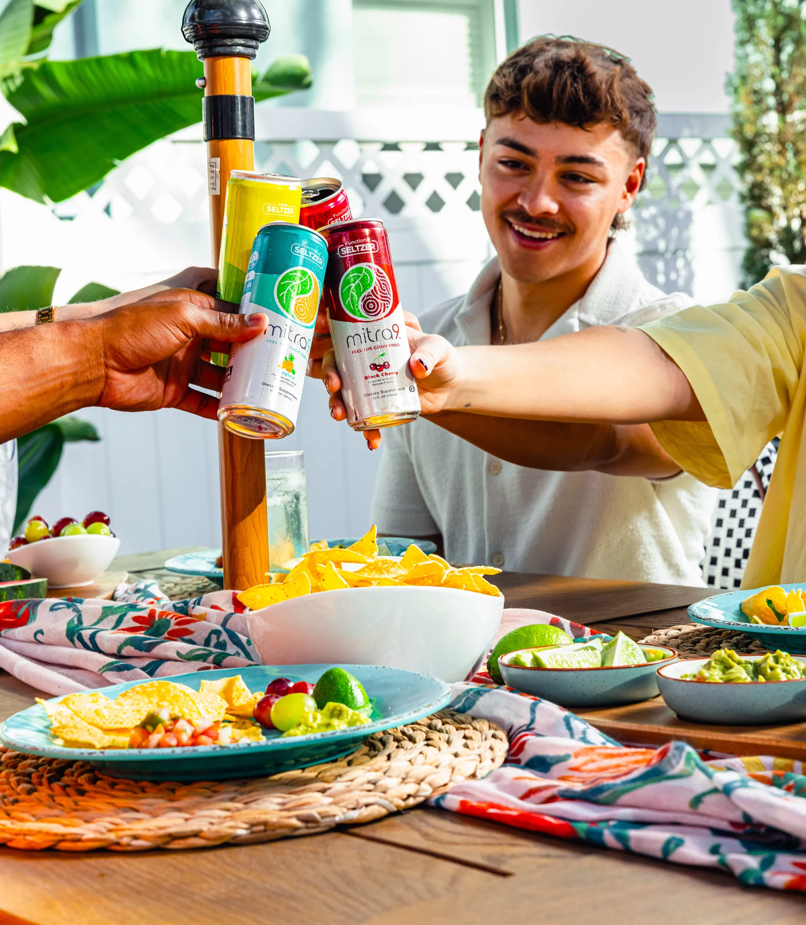
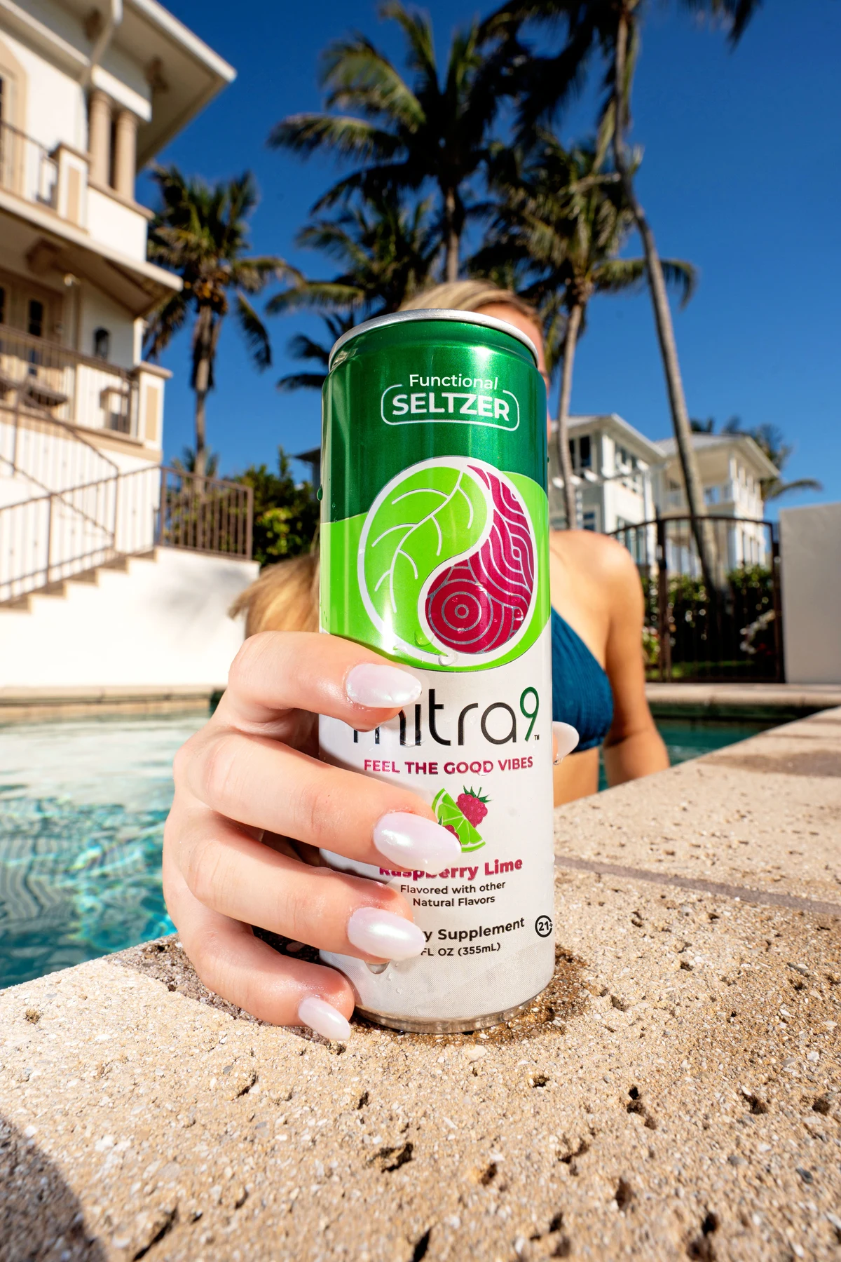
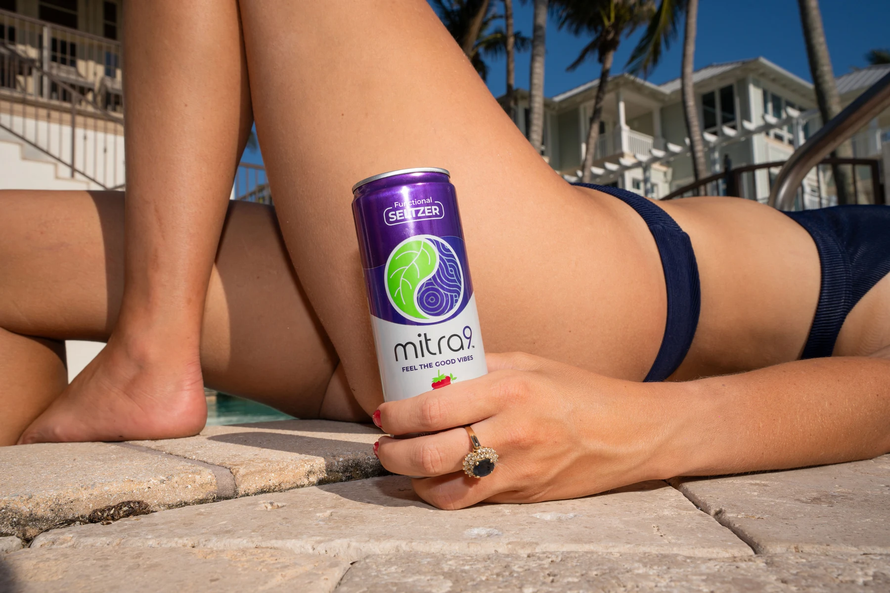
Good vibes, in real life
Energetic. Empowering. Made for social moments.
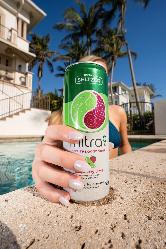
The core-message examples show Mitra9 in sunny, relaxed settings with the product close at hand. Use these images as a visual reference for lifestyle enjoyment and connection.
These are the original images embedded in the supplied PDF. Usage licenses and full-resolution production originals were not included.
Go to full photo gallery

09
Voice & messaging
Sound like Mitra9
Confident. Energetic. Modern.
Be direct, engaging, and informative. Use clear, active language and keep the brand’s personality present without sacrificing clarity.

THE CORE MESSAGE
feel the good vibes
FOR LIFESTYLE ENJOYMENT & SOCIAL SETTINGS
Say it clearly

do
Keep it active.
Use concise language. Describe the product clearly and connect the brand to lifestyle and social occasions.
“Elevate your vibe.”

don't
Overpromise.
Avoid overly complex language, unsupported health claims, and promises of instant results.
Have product benefit claims reviewed before external use.
Read the source voice guidelines

10
Asset library
The artwork from these brand guidelines, ready to preview and download.